> ## Documentation Index
> Fetch the complete documentation index at: https://moengage-unity-sdk-initialization-split.mintlify.site/llms.txt
> Use this file to discover all available pages before exploring further.
# How to Add Carousel Banners on App Home Page
# Introduction
Applying carousel banners on the home page of your website is a great way to engage with your app users and promote specific offerings.
In this article, we will learn how we can use MoEngage Self-Handled Cards to build a banner carousel on your Android and iOS native apps and create Card campaigns to deliver targeted Cards to your app visitors through these banner carousels.
# Expected Result
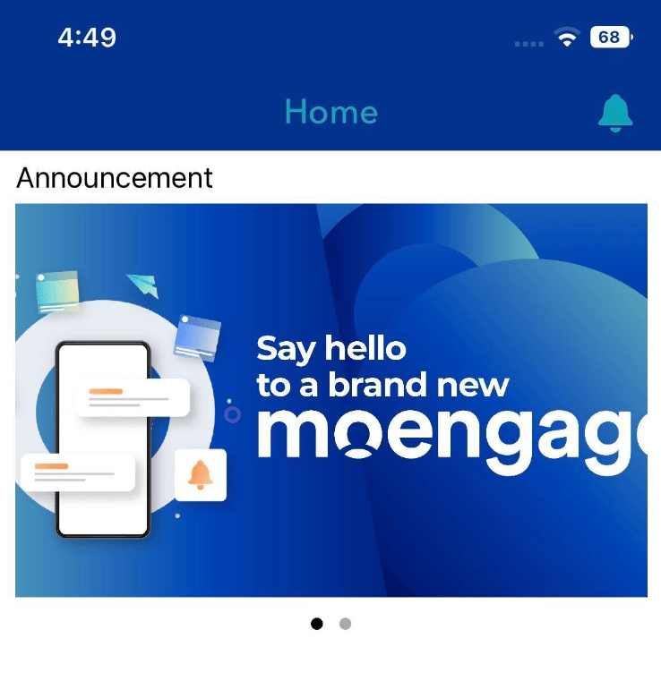
Users will see a carousel banner on the home page of your website:
 # Steps to Integrate
MoEngage self-handled Cards allow you to access the raw payload of the Card content. You can create components in your app to consume these payloads and display the Card content in a design and layout that works as an integrated component of your app.
The following steps will help you with the following:
1. [Cards Integration](/use-cases/cards/how-to-add-carousel-banners-on-app-home-page#step-1-cards-integration)
2. [Cards UI Creation for each Category](/use-cases/cards/how-to-add-carousel-banners-on-app-home-page#step-2-guide-for-cards-ui-creation)
3. [Parsing MoEngage Cards Payload and Feed into the Carousel UI](/use-cases/cards/how-to-add-carousel-banners-on-app-home-page#step-3-parsing-moengage-cards-payload-and-feed-into-the-carousel-ui)
4. [Track Analytics](/use-cases/cards/how-to-add-carousel-banners-on-app-home-page#step-4-track-analytics)
## Step 1: Cards Integration
### For Android
#### **Installing using Catalog**
Integration using a Version Catalog is the recommended way of integration; refer to the [Configure Version Catalog](https://developers.moengage.com/hc/en-us/articles/4407395989268) document to configure a catalog if not done already. Once you have configured the catalog add the dependency in the *app/build.gradle* file as shown below:
build.gradle
```json theme={null}
dependencies {
...
implementation(moengage.cardsCore)
}
```
Alternatively, you can add the dependency using Artifact ID as described in [Installation using Artifact ID](/developer-guide/android-sdk/sdk-integration/advanced-or-optional/installing-sdk-using-artifact-id#core). However, installation using Catalog ID is the recommended approach as installing using Artifact ID may lead to version mismatch if mapped incorrectly.
For more information, refer to [Self Handled Cards for Android native](/developer-guide/android-sdk/cards/self-handled-cards).
### For iOS
#### **Install using CocoaPod**
Integrate the MoEngageCards framework by adding the dependency in the podfile as shown below:
Ruby
```ruby theme={null}
pod 'MoEngageCards','~> 4.0.0'
```
Now run ` pod install` to install the framework
For more information, refer to [Self Handled Cards for iOS native](/developer-guide/ios-sdk/cards/self-handled-cards).
## Step 2: Guide for Cards UI Creation
Now that we have integrated self-handled cards, we will next build the UI that will consume the Card payload to show cards. For example, we have used **SliderView** and **ImageSlider**for Android and iOS respectively while building this use case. These will appear in a carousel format that slides for every 3-4 seconds (configurable) on the homepage.
The **SliderView** and **ImageSlider** are external libraries used in this use-case only as an example and are not maintained by MoEngage. We strongly recommend using libraries that you trust and best fit your use case.
**Points to be taken care of at the time of rendering the data to the UI**:
* The campaign-driven components of the UI should match with components existing in the cards payload eg. Title, message, action, image etc.
* A user may qualify not qualify for any cards, please handle removing the carousel widget or having backup content for such cases.
* For all the elements in the payload, check for exception scenarios like null values, syntax errors from the campaign, and image assets not getting fetched in time.
* If you have assets that may take a longer time to load, consider adding interim UI for a seamless user experience.
* Ensure the image dimensions used in campaigns should fit the image containers or the UI handles the image scaling.
* Texts (Header & Message) supports emojis and html format (for formatting, color etc) so ensure to handle that using Html.format() method.
* Pin to top feature is present in the "display\_control" and it has to be handled separately at the time of rendering to the UI (please refer to the sample payload for the structure).
* Illustration and Basic templates have slightly different payload structures. Please account for the null value in the image key with Basic Template
## Step 3: Parsing MoEngage Cards Payload and Feed into the Carousel UI
Now that we have built a UI, we will be learning how to parse the cards payload into a structure that feeds the UI.
Cards contain multiple categories and each category consists of two types of Cards as follows:
* **Basic**
* **Illustration**
In this document, we will see how the **Illustration** Card category of the Announcement type will appear in a carousel format, how to parse the Card data that we receive from MoEngage SDK, and how we render the data in the carousel layout that we created using external libraries.
### For Android
To fetch all the categories for which Cards are configured, use the *getCardCategories()* API.
In this example, we are using the *getCardsForCategory()* API to fetch the Cards that belong to Announcement Type.
```kotlin wrap theme={null}
/*Announcement is one of the categories and this API is used to fetch the card's data that belongs to Announcement Category*/
MoECardHelper.getCardsForCategory(context, "Announcements")
```
```java wrap theme={null}
/*Announcement is one of the categories and this API is used to fetch the card's data that belongs to Announcement Category*/
MoECardHelper.INSTANCE.getCardsForCategory(context, "Announcements");
```
If the function above returns the data and not NULL, then it signifies that the Card is delivered successfully and to notify this to MoEngage SDK, you call the following API. This will help you later with analytics.
```kotlin wrap theme={null}
/*To notify SDK that the Card's data are successfully fetched using the function mentioned above. */
MoECardHelper.cardDelivered(context)
```
```java wrap theme={null}
/*To notify SDK that the Card's data are successfully fetched using the function mentioned above. */
MoECardHelper.INSTANCE.cardDelivered(context);
```
After we get the Cards data from the function above, we need to parse the data to extract the details and store it in a Model class which will be used to render into the UI as shown in the following code snippet:
```kotlin wrap theme={null}
/*Card's data that is fetched based on category is given here as input and processed into CardModel.java class to store and use it later. */
override fun parseCardData(card: Card): CardModel {
var title: String
var description: String
val cardModel = CardModel()
cardModel.card = card
val container = card.template.containers[0]
cardModel.ctaAction = container.action
cardModel.container = container
//Getting the type of the Card Template
if (card.template.templateType == TemplateType.BASIC) cardModel.itemViewType =
Constants.CARD_BASIC else if (card.template.templateType == TemplateType.ILLUSTRATION) cardModel.itemViewType =
Constants.CARD_ILLUSTRATION
//Widget - is where the Image, Header, Body message, CTA are stored
// ID:0 - is Image
// ID:1 - is Text for Header
// ID:2 - is Text for Body
// ID:3 - is CTA button
for (widget in container.widgetList) {
cardModel.widget = widget
if (widget.id == 0 && widget.widgetType == WidgetType.IMAGE) {
//setImage
cardModel.imageFromUrl = widget.content
} else if (widget.id == 1 && widget.widgetType == WidgetType.TEXT) {
title = widget.content
cardModel.title = title
} else if (widget.id == 2 && widget.widgetType == WidgetType.TEXT) {
if (widget.content.isEmpty()) {
Log.e(Logger.TAG, " : Widget text missing will not show widget.")
continue
}
description = widget.content
cardModel.description = description
} else if (widget.id == 3 && widget.widgetType == WidgetType.BUTTON) {
if (!widget.content.isEmpty()) {
cardModel.ctaName = widget.content
}
}
}
val backgroundColor = Objects.requireNonNull(container.style).backgroundColor
if (!backgroundColor.isEmpty()) {
cardModel.backgroundColor = backgroundColor
}
return cardModel
}
```
```java wrap theme={null}
/*Card's data that is fetched based on category is given here as input and processed into CardModel.java class to store and use later. */
@Override
public CardModel parseCardData(Card card) {
String title, description;
CardModel cardModel = new CardModel();
cardModel.setCard(card);
Container container = card.getTemplate().getContainers().get(0);
cardModel.setCtaAction(container.getAction());
cardModel.setContainer(container);
//Getting the type of the Card Template
if (card.getTemplate().getTemplateType() == TemplateType.BASIC)
cardModel.setItemViewType(Constants.CARD_BASIC);
else if (card.getTemplate().getTemplateType() == TemplateType.ILLUSTRATION)
cardModel.setItemViewType(Constants.CARD_ILLUSTRATION);
//Widget - is where the Image, Header, Body message, CTA are stored
// ID:0 - is Image
// ID:1 - is Text for Header
// ID:2 - is Text for Body
// ID:3 - is CTA button
for (Widget widget : container.getWidgetList()) {
cardModel.setWidget(widget);
if (widget.getId() == 0 && widget.getWidgetType() == WidgetType.IMAGE) {
//setImage
cardModel.setImageFromUrl(widget.getContent());
} else if (widget.getId() == 1 && widget.getWidgetType() == WidgetType.TEXT) {
title = widget.getContent();
cardModel.setTitle(title);
} else if (widget.getId() == 2 && widget.getWidgetType() == WidgetType.TEXT) {
if (widget.getContent().isEmpty()) {
Log.e(TAG, " : Widget text missing will not show widget.");
continue;
}
description = widget.getContent();
cardModel.setDescription(description);
} else if (widget.getId() == 3 && widget.getWidgetType() == WidgetType.BUTTON) {
if(!widget.getContent().isEmpty()) {
cardModel.setCtaName(widget.getContent());
}
}
}
String backgroundColor = Objects.requireNonNull(container.getStyle()).getBackgroundColor();
if (!backgroundColor.isEmpty()) {
cardModel.setBackgroundColor(backgroundColor);
}
return cardModel;
}
```
These parsed values are sent to the SliderAdapter to render in the UI as shown in the following Slider Adapter class file.
After the Cards are rendered properly in the UI, you can notify the same to MoEngage by calling the APIs given in the [Self-handled Cards](/developer-guide/android-sdk/cards/self-handled-cards#widget-and-widget-id-mapping) document for Android SDK.
# Steps to Integrate
MoEngage self-handled Cards allow you to access the raw payload of the Card content. You can create components in your app to consume these payloads and display the Card content in a design and layout that works as an integrated component of your app.
The following steps will help you with the following:
1. [Cards Integration](/use-cases/cards/how-to-add-carousel-banners-on-app-home-page#step-1-cards-integration)
2. [Cards UI Creation for each Category](/use-cases/cards/how-to-add-carousel-banners-on-app-home-page#step-2-guide-for-cards-ui-creation)
3. [Parsing MoEngage Cards Payload and Feed into the Carousel UI](/use-cases/cards/how-to-add-carousel-banners-on-app-home-page#step-3-parsing-moengage-cards-payload-and-feed-into-the-carousel-ui)
4. [Track Analytics](/use-cases/cards/how-to-add-carousel-banners-on-app-home-page#step-4-track-analytics)
## Step 1: Cards Integration
### For Android
#### **Installing using Catalog**
Integration using a Version Catalog is the recommended way of integration; refer to the [Configure Version Catalog](https://developers.moengage.com/hc/en-us/articles/4407395989268) document to configure a catalog if not done already. Once you have configured the catalog add the dependency in the *app/build.gradle* file as shown below:
build.gradle
```json theme={null}
dependencies {
...
implementation(moengage.cardsCore)
}
```
Alternatively, you can add the dependency using Artifact ID as described in [Installation using Artifact ID](/developer-guide/android-sdk/sdk-integration/advanced-or-optional/installing-sdk-using-artifact-id#core). However, installation using Catalog ID is the recommended approach as installing using Artifact ID may lead to version mismatch if mapped incorrectly.
For more information, refer to [Self Handled Cards for Android native](/developer-guide/android-sdk/cards/self-handled-cards).
### For iOS
#### **Install using CocoaPod**
Integrate the MoEngageCards framework by adding the dependency in the podfile as shown below:
Ruby
```ruby theme={null}
pod 'MoEngageCards','~> 4.0.0'
```
Now run ` pod install` to install the framework
For more information, refer to [Self Handled Cards for iOS native](/developer-guide/ios-sdk/cards/self-handled-cards).
## Step 2: Guide for Cards UI Creation
Now that we have integrated self-handled cards, we will next build the UI that will consume the Card payload to show cards. For example, we have used **SliderView** and **ImageSlider**for Android and iOS respectively while building this use case. These will appear in a carousel format that slides for every 3-4 seconds (configurable) on the homepage.
The **SliderView** and **ImageSlider** are external libraries used in this use-case only as an example and are not maintained by MoEngage. We strongly recommend using libraries that you trust and best fit your use case.
**Points to be taken care of at the time of rendering the data to the UI**:
* The campaign-driven components of the UI should match with components existing in the cards payload eg. Title, message, action, image etc.
* A user may qualify not qualify for any cards, please handle removing the carousel widget or having backup content for such cases.
* For all the elements in the payload, check for exception scenarios like null values, syntax errors from the campaign, and image assets not getting fetched in time.
* If you have assets that may take a longer time to load, consider adding interim UI for a seamless user experience.
* Ensure the image dimensions used in campaigns should fit the image containers or the UI handles the image scaling.
* Texts (Header & Message) supports emojis and html format (for formatting, color etc) so ensure to handle that using Html.format() method.
* Pin to top feature is present in the "display\_control" and it has to be handled separately at the time of rendering to the UI (please refer to the sample payload for the structure).
* Illustration and Basic templates have slightly different payload structures. Please account for the null value in the image key with Basic Template
## Step 3: Parsing MoEngage Cards Payload and Feed into the Carousel UI
Now that we have built a UI, we will be learning how to parse the cards payload into a structure that feeds the UI.
Cards contain multiple categories and each category consists of two types of Cards as follows:
* **Basic**
* **Illustration**
In this document, we will see how the **Illustration** Card category of the Announcement type will appear in a carousel format, how to parse the Card data that we receive from MoEngage SDK, and how we render the data in the carousel layout that we created using external libraries.
### For Android
To fetch all the categories for which Cards are configured, use the *getCardCategories()* API.
In this example, we are using the *getCardsForCategory()* API to fetch the Cards that belong to Announcement Type.
```kotlin wrap theme={null}
/*Announcement is one of the categories and this API is used to fetch the card's data that belongs to Announcement Category*/
MoECardHelper.getCardsForCategory(context, "Announcements")
```
```java wrap theme={null}
/*Announcement is one of the categories and this API is used to fetch the card's data that belongs to Announcement Category*/
MoECardHelper.INSTANCE.getCardsForCategory(context, "Announcements");
```
If the function above returns the data and not NULL, then it signifies that the Card is delivered successfully and to notify this to MoEngage SDK, you call the following API. This will help you later with analytics.
```kotlin wrap theme={null}
/*To notify SDK that the Card's data are successfully fetched using the function mentioned above. */
MoECardHelper.cardDelivered(context)
```
```java wrap theme={null}
/*To notify SDK that the Card's data are successfully fetched using the function mentioned above. */
MoECardHelper.INSTANCE.cardDelivered(context);
```
After we get the Cards data from the function above, we need to parse the data to extract the details and store it in a Model class which will be used to render into the UI as shown in the following code snippet:
```kotlin wrap theme={null}
/*Card's data that is fetched based on category is given here as input and processed into CardModel.java class to store and use it later. */
override fun parseCardData(card: Card): CardModel {
var title: String
var description: String
val cardModel = CardModel()
cardModel.card = card
val container = card.template.containers[0]
cardModel.ctaAction = container.action
cardModel.container = container
//Getting the type of the Card Template
if (card.template.templateType == TemplateType.BASIC) cardModel.itemViewType =
Constants.CARD_BASIC else if (card.template.templateType == TemplateType.ILLUSTRATION) cardModel.itemViewType =
Constants.CARD_ILLUSTRATION
//Widget - is where the Image, Header, Body message, CTA are stored
// ID:0 - is Image
// ID:1 - is Text for Header
// ID:2 - is Text for Body
// ID:3 - is CTA button
for (widget in container.widgetList) {
cardModel.widget = widget
if (widget.id == 0 && widget.widgetType == WidgetType.IMAGE) {
//setImage
cardModel.imageFromUrl = widget.content
} else if (widget.id == 1 && widget.widgetType == WidgetType.TEXT) {
title = widget.content
cardModel.title = title
} else if (widget.id == 2 && widget.widgetType == WidgetType.TEXT) {
if (widget.content.isEmpty()) {
Log.e(Logger.TAG, " : Widget text missing will not show widget.")
continue
}
description = widget.content
cardModel.description = description
} else if (widget.id == 3 && widget.widgetType == WidgetType.BUTTON) {
if (!widget.content.isEmpty()) {
cardModel.ctaName = widget.content
}
}
}
val backgroundColor = Objects.requireNonNull(container.style).backgroundColor
if (!backgroundColor.isEmpty()) {
cardModel.backgroundColor = backgroundColor
}
return cardModel
}
```
```java wrap theme={null}
/*Card's data that is fetched based on category is given here as input and processed into CardModel.java class to store and use later. */
@Override
public CardModel parseCardData(Card card) {
String title, description;
CardModel cardModel = new CardModel();
cardModel.setCard(card);
Container container = card.getTemplate().getContainers().get(0);
cardModel.setCtaAction(container.getAction());
cardModel.setContainer(container);
//Getting the type of the Card Template
if (card.getTemplate().getTemplateType() == TemplateType.BASIC)
cardModel.setItemViewType(Constants.CARD_BASIC);
else if (card.getTemplate().getTemplateType() == TemplateType.ILLUSTRATION)
cardModel.setItemViewType(Constants.CARD_ILLUSTRATION);
//Widget - is where the Image, Header, Body message, CTA are stored
// ID:0 - is Image
// ID:1 - is Text for Header
// ID:2 - is Text for Body
// ID:3 - is CTA button
for (Widget widget : container.getWidgetList()) {
cardModel.setWidget(widget);
if (widget.getId() == 0 && widget.getWidgetType() == WidgetType.IMAGE) {
//setImage
cardModel.setImageFromUrl(widget.getContent());
} else if (widget.getId() == 1 && widget.getWidgetType() == WidgetType.TEXT) {
title = widget.getContent();
cardModel.setTitle(title);
} else if (widget.getId() == 2 && widget.getWidgetType() == WidgetType.TEXT) {
if (widget.getContent().isEmpty()) {
Log.e(TAG, " : Widget text missing will not show widget.");
continue;
}
description = widget.getContent();
cardModel.setDescription(description);
} else if (widget.getId() == 3 && widget.getWidgetType() == WidgetType.BUTTON) {
if(!widget.getContent().isEmpty()) {
cardModel.setCtaName(widget.getContent());
}
}
}
String backgroundColor = Objects.requireNonNull(container.getStyle()).getBackgroundColor();
if (!backgroundColor.isEmpty()) {
cardModel.setBackgroundColor(backgroundColor);
}
return cardModel;
}
```
These parsed values are sent to the SliderAdapter to render in the UI as shown in the following Slider Adapter class file.
After the Cards are rendered properly in the UI, you can notify the same to MoEngage by calling the APIs given in the [Self-handled Cards](/developer-guide/android-sdk/cards/self-handled-cards#widget-and-widget-id-mapping) document for Android SDK.
 ### For iOS
To fetch all the categories for which Cards are configured, use the getCardsCategories API. To fetch all the categories for which Cards are configured, use the getCardsCategories API.
Swift
```swift wrap theme={null}
MoEngageSDKCards.sharedInstance.getCardsCategories { categories, accountMeta in
print("Fetched Cards Categories \(categories)")
for category in categories {
self.getCardData(category: category)
}
}
```
To get the Card data based on category, use the API getCards as shown below:
Swift
```swift wrap theme={null}
func getCardData(category: String) {
MoEngageSDKCards.sharedInstance.getCards(forCategory: category) { cards, accountMeta in
print("Fetched cards for given category")
if(category == "Announcements") {
var mSliderData = Array()
var mDataForAnnouncements = Array()
mDataForAnnouncements = cards
for cardData in mDataForAnnouncements {
var cardModel = NewCardModel()
cardModel = parseData(cardData: cardData)
mSliderData.append(cardModel)
}
var afUrlSource = [SDWebImageSource(urlString: "https://images.unsplash.com/photo-1432679963831-2dab49187847?w=1080")!]
if(mSliderData.count > 0){
for cardData in mSliderData {
if(cardData.templateType == MoEngageCardTemplateType.illustration){
afUrlSource.append(SDWebImageSource(urlString: cardData.imageFromUrl ?? "")!)
}
}
if(afUrlSource.count > 1) {
afUrlSource.remove(at: 0)
self.slideshow.setImageInputs(afUrlSource)
} else {
self.slideshow.setImageInputs(self.localSource)
}
} else {
self.slideshow.setImageInputs(self.localSource)
}
}
}
```
If the function above returns the data and not NULL, then it signifies that the Card is delivered successfully and to notify this to MoEngage SDK, you call this below API. This will help you later with analytics.
Swift
```swift wrap theme={null}
MoEngageSDKCards.sharedInstance.cardDelivered(cardCampaign, forAppID: "YOUR APP ID")
```
After we get the Cards data from the function above, we need to parse the data to extract the details and store it in a Model class, which will be used to render into the UI as shown in the following code snippet:
Swift
```swift wrap theme={null}
func parseData(cardData: MoEngageCardCampaign) -> NewCardModel {
let newCardModel = NewCardModel()
newCardModel.card = cardData
let container : MoEngageCardContainer = (cardData.templateData?.containers.first)!
newCardModel.container = container
newCardModel.ctaAction = container.actions
if(cardData.templateData?.type == MoEngageCardTemplateType.basic) {
newCardModel.itemViewType = "Basic"
} else {
newCardModel.itemViewType = "Illustration"
}
newCardModel.templateType = cardData.templateData?.type;
for widgetData in container.widgets {
newCardModel.widget = widgetData
if(widgetData.id == 0 && widgetData.type == MoEngageCardWidgetType.image) {
newCardModel.imageFromUrl = widgetData.content
} else if(widgetData.id == 1 && widgetData.type == MoEngageCardWidgetType.text) {
newCardModel.cardTitle = widgetData.content
} else if(widgetData.id == 2 && widgetData.type == MoEngageCardWidgetType.text) {
if(widgetData.content.isEmpty) {
print("Widget text missing will not show widget.")
continue
}
newCardModel.cardDescription = widgetData.content
} else if(widgetData.id == 3 && widgetData.type == MoEngageCardWidgetType.button) {
if(!widgetData.content.isEmpty) {
newCardModel.ctaAction = widgetData.actions
}
}
}
return newCardModel
}
}
```
These parsed values are sent to the ImageSlider to render it in the UI.
After the Cards are rendered properly in the UI, you can notify the same to MoEngage by calling the APIs given in the [Self-handled Cards](/developer-guide/ios-sdk/cards/self-handled-cards#track-statistics-for-cards) document for iOS SDK.
### For iOS
To fetch all the categories for which Cards are configured, use the getCardsCategories API. To fetch all the categories for which Cards are configured, use the getCardsCategories API.
Swift
```swift wrap theme={null}
MoEngageSDKCards.sharedInstance.getCardsCategories { categories, accountMeta in
print("Fetched Cards Categories \(categories)")
for category in categories {
self.getCardData(category: category)
}
}
```
To get the Card data based on category, use the API getCards as shown below:
Swift
```swift wrap theme={null}
func getCardData(category: String) {
MoEngageSDKCards.sharedInstance.getCards(forCategory: category) { cards, accountMeta in
print("Fetched cards for given category")
if(category == "Announcements") {
var mSliderData = Array()
var mDataForAnnouncements = Array()
mDataForAnnouncements = cards
for cardData in mDataForAnnouncements {
var cardModel = NewCardModel()
cardModel = parseData(cardData: cardData)
mSliderData.append(cardModel)
}
var afUrlSource = [SDWebImageSource(urlString: "https://images.unsplash.com/photo-1432679963831-2dab49187847?w=1080")!]
if(mSliderData.count > 0){
for cardData in mSliderData {
if(cardData.templateType == MoEngageCardTemplateType.illustration){
afUrlSource.append(SDWebImageSource(urlString: cardData.imageFromUrl ?? "")!)
}
}
if(afUrlSource.count > 1) {
afUrlSource.remove(at: 0)
self.slideshow.setImageInputs(afUrlSource)
} else {
self.slideshow.setImageInputs(self.localSource)
}
} else {
self.slideshow.setImageInputs(self.localSource)
}
}
}
```
If the function above returns the data and not NULL, then it signifies that the Card is delivered successfully and to notify this to MoEngage SDK, you call this below API. This will help you later with analytics.
Swift
```swift wrap theme={null}
MoEngageSDKCards.sharedInstance.cardDelivered(cardCampaign, forAppID: "YOUR APP ID")
```
After we get the Cards data from the function above, we need to parse the data to extract the details and store it in a Model class, which will be used to render into the UI as shown in the following code snippet:
Swift
```swift wrap theme={null}
func parseData(cardData: MoEngageCardCampaign) -> NewCardModel {
let newCardModel = NewCardModel()
newCardModel.card = cardData
let container : MoEngageCardContainer = (cardData.templateData?.containers.first)!
newCardModel.container = container
newCardModel.ctaAction = container.actions
if(cardData.templateData?.type == MoEngageCardTemplateType.basic) {
newCardModel.itemViewType = "Basic"
} else {
newCardModel.itemViewType = "Illustration"
}
newCardModel.templateType = cardData.templateData?.type;
for widgetData in container.widgets {
newCardModel.widget = widgetData
if(widgetData.id == 0 && widgetData.type == MoEngageCardWidgetType.image) {
newCardModel.imageFromUrl = widgetData.content
} else if(widgetData.id == 1 && widgetData.type == MoEngageCardWidgetType.text) {
newCardModel.cardTitle = widgetData.content
} else if(widgetData.id == 2 && widgetData.type == MoEngageCardWidgetType.text) {
if(widgetData.content.isEmpty) {
print("Widget text missing will not show widget.")
continue
}
newCardModel.cardDescription = widgetData.content
} else if(widgetData.id == 3 && widgetData.type == MoEngageCardWidgetType.button) {
if(!widgetData.content.isEmpty) {
newCardModel.ctaAction = widgetData.actions
}
}
}
return newCardModel
}
}
```
These parsed values are sent to the ImageSlider to render it in the UI.
After the Cards are rendered properly in the UI, you can notify the same to MoEngage by calling the APIs given in the [Self-handled Cards](/developer-guide/ios-sdk/cards/self-handled-cards#track-statistics-for-cards) document for iOS SDK.
 ## Step 4: Track Analytics
After the Cards are rendered properly in the UI, you can use MoEngage SDKs that provide APIs to fetch the Card's data, allowing you to track the usage and analytics of the Cards. To learn more, refer to the following documents:
* [Track Statistics for Cards in Android](/developer-guide/android-sdk/cards/self-handled-cards#track-statistics-for-cards)
* [Track Statistics for Cards in iOS](/developer-guide/ios-sdk/cards/self-handled-cards#track-statistics-for-cards)
# Test Campaigns
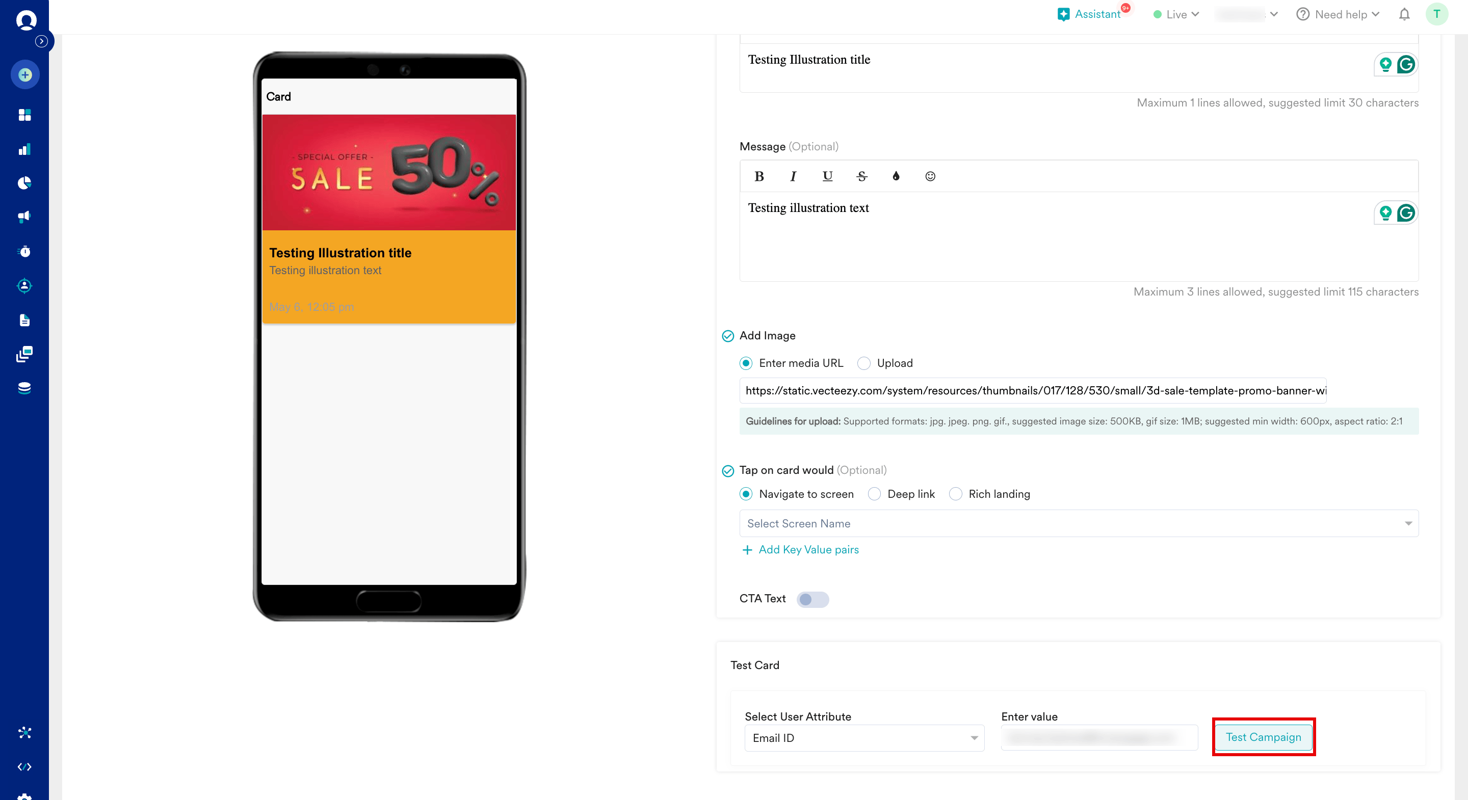
Creating carousel Cards is similar to [creating a Card campaign](/user-guide/campaigns-and-channels/cards/create/create-a-card-campaign) for your application. While you are creating Cards, navigate to the step **Create view** on your MoEngage dashboard and scroll down to the **Test Card** section. You can test the output of your newly created Card by selecting a custom attribute and its value for a test user.
## Before Testing
## Step 4: Track Analytics
After the Cards are rendered properly in the UI, you can use MoEngage SDKs that provide APIs to fetch the Card's data, allowing you to track the usage and analytics of the Cards. To learn more, refer to the following documents:
* [Track Statistics for Cards in Android](/developer-guide/android-sdk/cards/self-handled-cards#track-statistics-for-cards)
* [Track Statistics for Cards in iOS](/developer-guide/ios-sdk/cards/self-handled-cards#track-statistics-for-cards)
# Test Campaigns
Creating carousel Cards is similar to [creating a Card campaign](/user-guide/campaigns-and-channels/cards/create/create-a-card-campaign) for your application. While you are creating Cards, navigate to the step **Create view** on your MoEngage dashboard and scroll down to the **Test Card** section. You can test the output of your newly created Card by selecting a custom attribute and its value for a test user.
## Before Testing
 ## Expected Result
The Test Card section enables you to view the campaign on a test device to ensure that your intended message is being conveyed in the desired way.
# Recommendation for Additional Layouts
This document illustrated an example of creating carousel Cards using the [Auto Image Slider in Android](https://www.geeksforgeeks.org/auto-image-slider-in-android-with-example/) and [Image Slideshow on Cocoapods in iOS](https://cocoapods.org/pods/ImageSlideshow). You can use the same method to create Cards with either Basic or Illustration template and parse the payload to build different UI layouts with different libraries.
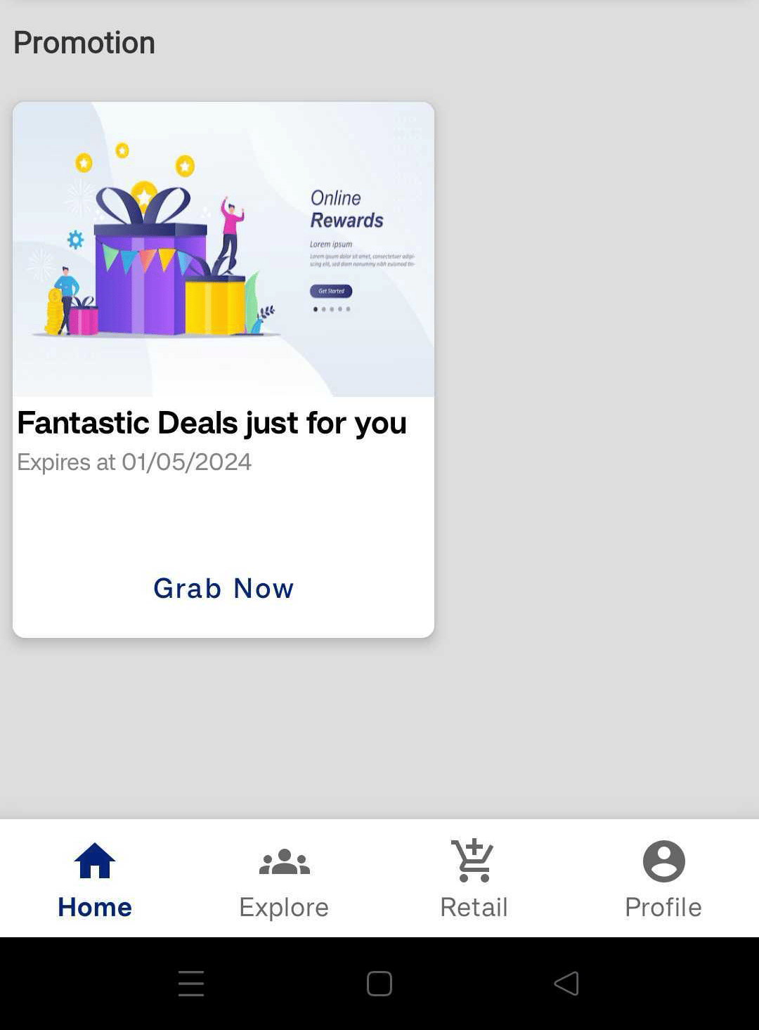
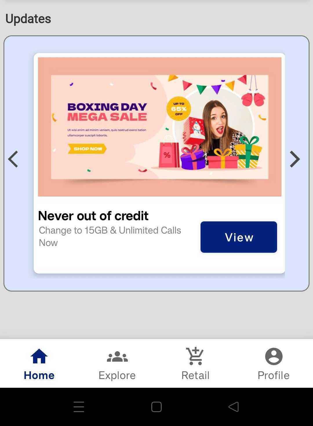
Here are a few examples for layouts that can be used instead of carousels:
## Expected Result
The Test Card section enables you to view the campaign on a test device to ensure that your intended message is being conveyed in the desired way.
# Recommendation for Additional Layouts
This document illustrated an example of creating carousel Cards using the [Auto Image Slider in Android](https://www.geeksforgeeks.org/auto-image-slider-in-android-with-example/) and [Image Slideshow on Cocoapods in iOS](https://cocoapods.org/pods/ImageSlideshow). You can use the same method to create Cards with either Basic or Illustration template and parse the payload to build different UI layouts with different libraries.
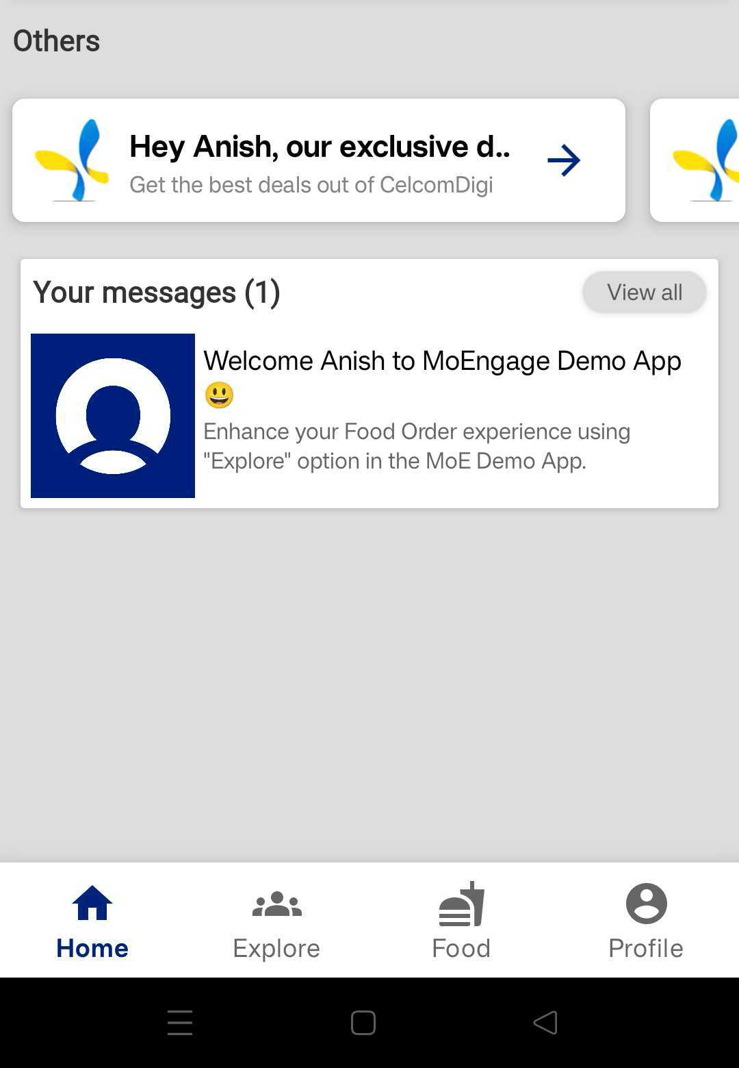
Here are a few examples for layouts that can be used instead of carousels:
 ## Sample Cards Payload
You can populate any layout by parsing the Card payload into UI elements similar to how the content was parsed for the carousel use case we saw above. Here is a sample payload for a card:
JSON
```json wrap theme={null}
"cards": [
{
"id": "640g66767676hh56565656_F_T_CA_AB_0_P_0_L_0_android",
"platform": "android",
"created_at": 1686051528,
"updated_at": 1686051528,
"meta_data": {
"cid": "647f136f28cd97f6106b86c4_F_T_CA_AB_0_P_0_L_0",
"moe_card_id": "640g66767676hh56565656_F_T_CA_AB_0_P_0_L_0_android",
"moe_campaign_name": "Demo Card Campaign",
"moe_delivery_type": "Event Triggered",
"moe_campaign_id": "647f136f28cd97f6106b86c4"
},
"template_data": {
"type": "basic",
"containers": [
{
"widgets": [
{
"content": "https://image.moengage.com/apiqasanityreactmoengage/20230606110034350340RKQN5HScreenshot2023060614443597f7c44fa5c96f29b225c53b361750eadajpgcompapiqasanityreactmoengage.jpg",
"type": "image",
"id": 0
},
{
"content": "
## Sample Cards Payload
You can populate any layout by parsing the Card payload into UI elements similar to how the content was parsed for the carousel use case we saw above. Here is a sample payload for a card:
JSON
```json wrap theme={null}
"cards": [
{
"id": "640g66767676hh56565656_F_T_CA_AB_0_P_0_L_0_android",
"platform": "android",
"created_at": 1686051528,
"updated_at": 1686051528,
"meta_data": {
"cid": "647f136f28cd97f6106b86c4_F_T_CA_AB_0_P_0_L_0",
"moe_card_id": "640g66767676hh56565656_F_T_CA_AB_0_P_0_L_0_android",
"moe_campaign_name": "Demo Card Campaign",
"moe_delivery_type": "Event Triggered",
"moe_campaign_id": "647f136f28cd97f6106b86c4"
},
"template_data": {
"type": "basic",
"containers": [
{
"widgets": [
{
"content": "https://image.moengage.com/apiqasanityreactmoengage/20230606110034350340RKQN5HScreenshot2023060614443597f7c44fa5c96f29b225c53b361750eadajpgcompapiqasanityreactmoengage.jpg",
"type": "image",
"id": 0
},
{
"content": "john.doe@example.com
",
"type": "text",
"id": 1
},
{
"content": "Sample
",
"type": "text",
"id": 2
},
{
"content": "Click
",
"type": "button",
"id": 3,
"actions": [
{
"type": "deepLink",
"name": "navigate",
"value": "https://www.moengage.com",
"kvPairs": {}
}
]
}
],
"style": {
"bgColor": "#4e3db0"
},
"type": "basic",
"id": 0,
"actions": []
}
]
},
"user_activity": {
"is_clicked": false
},
"display_controls": {
"is_pin": true,
"expire_after_delivered": 2592000
},
"category": "Promotions"
}
]
}
}
```
## Add Additional Keys in the Card Payload
The cards standard payload consists of card campaign details, expiry details, title, message, image and action.
If you want to add additional data in the cards payload you recieve, you can add them as part of the Primary action for the card while creating the card campaign in the for for Key-Value pairs as seen below.
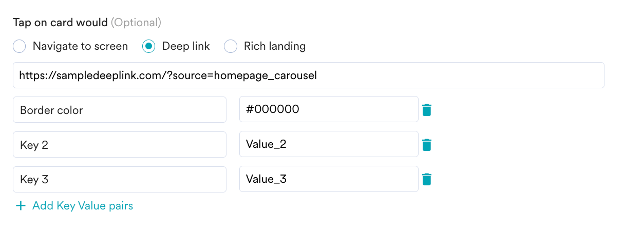 These K-V pairs will be part of the Card payload under action and can be parsed to be used in the self-handled cards UI.
# Placement for Different Widgets in the App
In the example above, we used the Announcement Card category to filter cards that should be added to the Carousel Widget in the home page.
If you are implementing self-handled cards in multiple sections of your app (including multiple sections in the same page), we recommend using Card Categories to differentiate between the sections. This way, you can use the function [Fetch cards for Categories](/developer-guide/android-sdk/cards/self-handled-cards#fetch-cards-for-categories) to fetch only the relevant cards for that section.
To set card categories, [raise a support ticket](/user-guide/contact-support/raise-a-support-ticket-through-moengage-dashboard).
# Conclusion
In this use case, we learnt how to use MoEngage Self-Handled Cards to build a banner carousel on your Android and iOS native apps and create Card campaigns to deliver targeted Cards to your app visitors through these banner carousels.
We also learnt how you can use a combination of different layouts, Card categories, and K-V pairs to implement any type of Interactive widgets as part of your users’ journey.
These K-V pairs will be part of the Card payload under action and can be parsed to be used in the self-handled cards UI.
# Placement for Different Widgets in the App
In the example above, we used the Announcement Card category to filter cards that should be added to the Carousel Widget in the home page.
If you are implementing self-handled cards in multiple sections of your app (including multiple sections in the same page), we recommend using Card Categories to differentiate between the sections. This way, you can use the function [Fetch cards for Categories](/developer-guide/android-sdk/cards/self-handled-cards#fetch-cards-for-categories) to fetch only the relevant cards for that section.
To set card categories, [raise a support ticket](/user-guide/contact-support/raise-a-support-ticket-through-moengage-dashboard).
# Conclusion
In this use case, we learnt how to use MoEngage Self-Handled Cards to build a banner carousel on your Android and iOS native apps and create Card campaigns to deliver targeted Cards to your app visitors through these banner carousels.
We also learnt how you can use a combination of different layouts, Card categories, and K-V pairs to implement any type of Interactive widgets as part of your users’ journey.